Designing the User Experience to Prevent Human Error
Welcome back! In the part one we discussed the user experience flaw that created Saturday’s false missile alert in Hawai’i. Now we’re going to look at how user experience design helps us avoid this kind of human error.
How Hawai’i Could’ve Avoided Saturday’s Events
Just a few minutes dedicated to user experience design could have saved the state of Hawai’i a lot of trouble, and here’s how:
User Research – Understanding user behavior is critical to UX. Included is the way a user’s eye’s moves through content, how a user navigates and searches for information, and how they resolve issues when accessing a site.
User Interface Design – To create a usable site, you need to know how a user will interact with it to accomplish their objective, and then facilitate this through design.
User Testing – An often overlooked step is having real world users test a site and provide feedback. With this feedback, a designer can make revisions as needed to improve the user’s experience.
Take a look at the mockups below to see how this could’ve gone in the state of Hawai’i. They’re basic, but they illustrate the point.
How it Could’ve Gone (User Experience Case Study):
SCENARIO: A diverse group of state employees who will interact with this system are asked to test it.
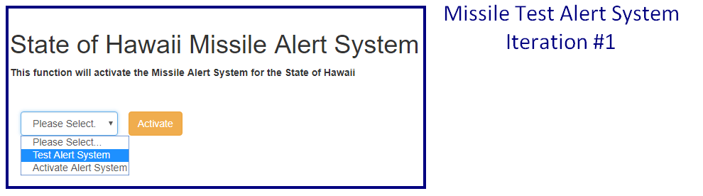
Exhibit A – Sample Missile Alert System Interface Version 1
FEEDBACK: The following comments are a selection of possible problem areas based on the initial group’s feedback:
User 1 (Female, age 44): “I think this is good, but what if someone isn’t paying attention and clicks the wrong button?Does the alert start instantly?”
User 2 (Male, age 27): “Maybe give a little more info on what the options are here? I can see this going wrong sooner or later.”
User 3 (Male, age 58): “Can you add a warning message? I click the wrong button all the time when I haven’t had my coffee- wouldn’t want to trigger a missile alert, haha!”
RESULT: After multiple testing sessions and iterations, the designer recommends a modified design. If approved, a final focus group will test it before release.
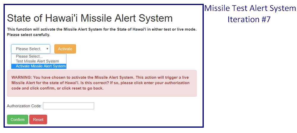
Exhibit B – Sample Missile Alert System Interface Version 7
As you can see, the interface has changed, but the basic details remain the same, only much improved. More importantly, user feedback prevented a potential catastrophe.
This all seems like a lot of time and effort, but the benefit is that your users will love you for it. And, y’know, you won’t accidentally set off a missile alarm and trigger mass panic throughout an entire state. That too.
The End?
This isn’t a comprehensive study of User Experience, we’ve barely scratched the surface. Stay tuned or subscribe, next time we’ll look in depth at the principles of user experience.
If you want to do some reading in the meantime, check out the U.S. Department of Health and Human Services website on Usability found here.
Finally, if there’s one book I would recommend to anyone interested in the topic of usability, it’s Don’t Make Me Think by Steve Krug. [link]
As always, if you’re feeling lost, give me a call at 858-461-9736. You can also use the form below or click here to contact me today for a free consultation.