5 UX Principles Your Website Can’t Live Without

Lately we’ve been talking a lot about about User Experience, or UX, and there’s a very good reason for that. UX is all about how we interact with things, and if you can craft a great one for your customer odds are they’ll want to interact with your site more. So here’s 5 UX principles your website can’t life without.

Cognitive Load – a.k.a. A Crash Course in Information Theory

When’s the last time you stuck around to use a broken website? Odds are, like most of us you simply closed your tab and moved on to a similar site. There’s a really good reason for that and it has to do with something often referred to as cognitive load, which is closely related to information theory.

The basic idea is that every moment of every day, our brains are taking in a truly mind-boggling level of information. Scientists tell us that it’s roughly 11,000,000 bits per second. Instantly, our conscious brain compresses that down to a far more usable 50 bits per second. (source)

We live in a world that demands non-stop attention, which is exhausting on its own, and every choice you make and every second you spend trying to figure something out increases the load.

We don’t mind making simple choices but nobody wants to become a detective to figure out why a website isn’t working when there’s thousands of others out there just like it.

Here’s where user experience is vital.

5 UX Principles Your Website Can’t Live Without

  1. If a user has to figure out your site, there’s something wrong with it. There’s nothing wrong with innovation, but there are some standards you need to stick to for the sake of your audience.
  2. Keep it simple. Visual clutter increases cognitive load.
  3. Organization is vital. Make it obvious where they are and what needs to happen next.
  4. Avoid Wall of Text DOOM. Have you ever opened a page, seen an ominous wall of text without formatting, images, or line breaks and backed away slowly, in terror? Yeah, me too.
  5. Testing is your friend. Even having a friend take five minutes to give you their feelings as they navigate the site is better than nothing and will help you see how real people use the web.

The End?

Obviously this isn’t all you need to know about user experience, but honestly, a lot of it is about common sense. Stay tuned or subscribe, next time we’re demystifying domains and internet hosting.

If you want to do some reading in the meantime, check out the U.S. Department of Health and Human Services website on Usability found here.

Finally, if there’s one book I would recommend to anyone interested in the topic of usability, it’s Don’t Make Me Think by Steve Krug. [link]

As always, if you’re feeling lost, give me a call at 858-461-9736. You can also use the form below or click here to contact me today for a free consultation.

Lessons Learned from Hawai’i – User Experience Pt. 2

Designing the User Experience to Prevent Human Error

Welcome back! In the part one we discussed the user experience flaw that created Saturday’s false missile alert in Hawai’i. Now we’re going to look at how user experience design helps us avoid this kind of human error.

How Hawai’i Could’ve Avoided Saturday’s Events

Just a few minutes dedicated to user experience design could have saved the state of Hawai’i a lot of trouble, and here’s how:

  1. User Research – Understanding user behavior is critical to UX. Included is the way a user’s eye’s moves through content, how a user navigates and searches for information, and how they resolve issues when accessing a site.
  2. User Interface Design – To create a usable site, you need to know how a user will interact with it to accomplish their objective, and then facilitate this through design.
  3. User Testing – An often overlooked step is having real world users test a site and provide feedback. With this feedback, a designer can make revisions as needed to improve the user’s experience.
    Take a look at the mockups below to see how this could’ve gone in the state of Hawai’i. They’re basic, but they illustrate the point.

How it Could’ve Gone (User Experience Case Study):

SCENARIO: A diverse group of state employees who will interact with this system are asked to test it.

user experience design mockup 1
Exhibit A – Sample Missile Alert System Interface Version 1


FEEDBACK: The following comments are a selection of possible problem areas based on the initial group’s feedback:

User 1 (Female, age 44): “I think this is good, but what if someone isn’t paying attention and clicks the wrong button? Does the alert start instantly?”

User 2 (Male, age 27): “Maybe give a little more info on what the options are here? I can see this going wrong sooner or later.”

User 3 (Male, age 58): “Can you add a warning message? I click the wrong button all the time when I haven’t had my coffee- wouldn’t want to trigger a missile alert, haha!” 


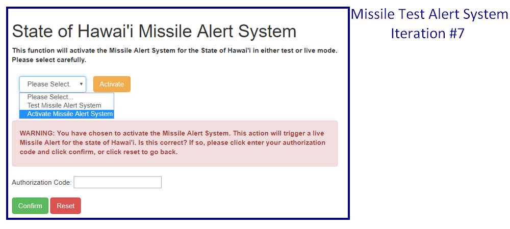
RESULT: After multiple testing sessions and iterations, the designer recommends a modified design. If approved, a final focus group will test it before release.

user experience design mockup 2
Exhibit B – Sample Missile Alert System Interface Version 7


As you can see, the interface has changed, but the basic details remain the same, only much improved. More importantly, user feedback prevented a potential catastrophe.

This all seems like a lot of time and effort, but the benefit is that your users will love you for it. And, y’know, you won’t accidentally set off a missile alarm and trigger mass panic throughout an entire state. That too.

The End?

This isn’t a comprehensive study of User Experience, we’ve barely scratched the surface. Stay tuned or subscribe, next time we’ll look in depth at the principles of user experience.

If you want to do some reading in the meantime, check out the U.S. Department of Health and Human Services website on Usability found here.

Finally, if there’s one book I would recommend to anyone interested in the topic of usability, it’s Don’t Make Me Think by Steve Krug. [link]

As always, if you’re feeling lost, give me a call at 858-461-9736. You can also use the form below or click here to contact me today for a free consultation.

Lessons Learned from Hawai’i – User Experience Pt. 1

User Experience Matters- Why?

A slightly longer article this time with a real world example straight from the news. It well illustrates both the importance of user experience and the fact that we generally don’t notice it unless it goes horribly wrong.

User Experience Gone Awry

Bear with me- I’m sure you’ve heard this story recently. This past Saturday morning in Hawai’i, a government employee selected the wrong option from a dropdown menu during what should have been a routine systems check. Instead of testing the state’s missile alert system, an actual missile alert began.

38 minutes of terror and confusion ensued, with panicked residents and tourists doing everything from seeking shelter below manholes to drinking vodka shots and sending goodbye messages to loved ones.

The state corrected the alert but the damage was already done, and the citizens of Hawai’i were reeling in the aftermath. First, there was a numb layer of shock. It had all been a mistake. And then the anger set in.

Eventually the state provided images of the menu the employee was using- a jumbled mess of links for everything from Amber Alerts to High Surf warnings. None of the options appear with explanations or validation options.

The employee responsible was reassigned, and the state committed to reviewing its emergency management systems. Still, for some of those impacted by the events of that Saturday morning, it’s not enough. And many more people are still wondering ‘how could this happen?’

In large part, beyond human error or incompetence, this error can be directly traced to faulty user experience design.

So What is User Experience?

The U.S. Department of Health and Human Services defines User Experience (UX for short) as focusing on “having a deep understanding of users, what they need, what they value, their abilities, and also their limitations.  It also takes into account the business goals and objectives of the group managing the project. UX best practices promote improving the quality of the user’s interaction with and perceptions of your product and any related services.” [source, italics ours]

In short, it must be easy to access, navigate and use.

The End?

This isn’t a comprehensive study of User Experience, we’ve barely scratched the surface. Stay tuned or subscribe, in part two we’re going to look at how things could have gone differently on Saturday.

As always, if you’re feeling lost, give me a call at 858-461-9736. You can also use the form below or click here to contact me today for a free consultation.